Mobile-friendly sites will rank higher in Google search results
The writing has been on the wall for some time now and anyone with a Google Webmaster Tools account (you do have one don’t you?) and a website that isn’t mobile-friendly, will have received emails warning them that their website is not mobile friendly:
The errors on these pages severely affect how mobile users are able to experience your website. These pages will not be seen as mobile-friendly by Google Search, and will therefore be displayed and ranked appropriately for smartphone users.
Mobile-friendly search results
And mobile-friendly search results is the key. Nearly forty percent of those reading this are likely doing so on a mobile device. That’s how our browsing behaviour has changed over the years and if your website doesn’t cater for mobile users you are losing out on customers.
According to global web stats company StatCounter, In April, 62.4% of browsing took place on a Desktop, 31.7% on mobile phones, and tablets accounted for 5.8% of browsing.
But desktop browsing is, in fact, on the decline. From April 2012 to today it has dropped from 85.6% to 70.5% with mobile use increasing and tablet & console browsing remaining steady.
Google announced its plans over two months ago, creating a step-by-step guide for web site owners to follow but has been tweaking the mobile search results for some time now. Back in November 2014 Google announced that they were rolling out changes to mobile search results to make it easier for users by adding a “mobile-friendly” label to their mobile search results and stated:.
This change will be rolling out globally over the next few weeks. A page is eligible for the “mobile-friendly” label if it meets the following criteria as detected by Googlebot:
- Avoids software that is not common on mobile devices, like Flash
- Uses text that is readable without zooming
- Sizes content to the screen so users don’t have to scroll horizontally or zoom
- Places links far enough apart so that the correct one can be easily tapped
So how do I make my website mobile-friendly?
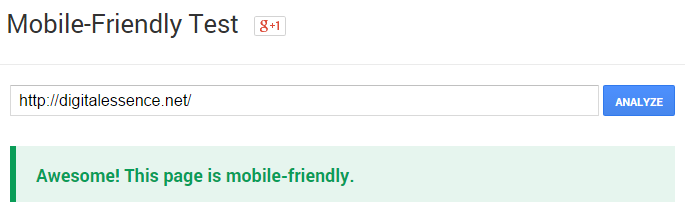
Your first step to making sure your website meets Google’s requirements and is deemed “mobile-friendly” is to use Google’s Mobile-Friendly Test. Enter your web site URL and press Analyze.
If everything goes well and your website is mobile-friendly then you should see a result like this.
If your website fails and doesn’t work correctly on a mobile device then you will see a result like this.

Don’t panic… All is not lost.
Depending on how you built your site there are several ways you can improve matters. If it was built on a modern Content Management System (CMS) like WordPress then you can head over to their themes section and use the Feature Filter to filter by responsive themes for a list that will work in mobile devices and pass the Google mobile-friendly test.
If the website was developed by a 3rd party then you can either contact them or another company who will be able to advise how best to resolve the issues.
And if you coded your website yourself… Then you can either roll up your sleeves and get to work or consider moving to a modern CMS or contact a 3rd party.
We hope you found this post useful. Mobile usage is only going to get bigger so it makes sense to not only have your website ranking well in search results but more importantly working correctly on these devices so your users and customers can browse your website and do business with you.
If you’d like to discuss how we can help make your website mobile-friendly then please call us on 01896 888 235 or fill out the form on our Contact page and we will get back to you.

